


Responsive Web Design
Responsive Web Design: Adapting Seamlessly to Every Screen Size
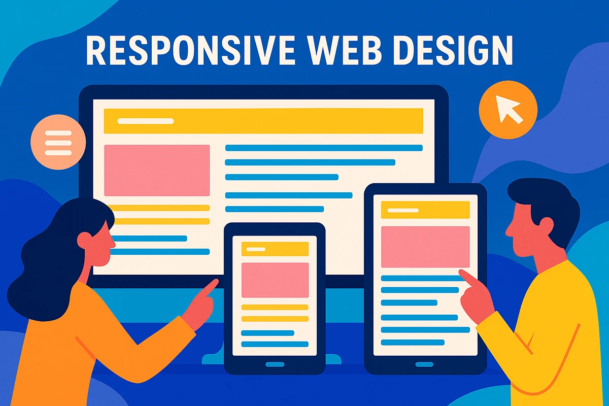
Responsive Web Design ensures your website delivers a consistent and user-friendly experience across all devices and screen sizes.
The Importance of Responsive Web Design
Responsive Web Design is no longer just a technical preference—it’s the foundation of a successful online presence. As mobile usage continues to rise year after year, businesses must adapt or risk being left behind. Since 2016, mobile internet usage has outpaced desktop browsing, and the trend has only accelerated. Today, many Americans—particularly younger audiences and households without home broadband—rely entirely on smartphones to access the internet. These users expect seamless experiences no matter what device they’re using, and if your website can’t deliver, they’ll move on quickly.
A responsive website adapts in real time to the screen size and capabilities of the device accessing it. Whether it’s a smartphone, tablet, laptop, or widescreen monitor, the design shifts and adjusts intelligently, ensuring your content remains easy to read, navigate, and engage with. Users shouldn’t have to pinch to zoom, scroll sideways, or wait for oversized images to load. With responsive design, your site becomes fluid, dynamic, and intuitive, meeting visitors exactly where they are.
What Makes a Website Responsive?
Responsive Web Design isn’t just about shrinking or expanding content. It involves using flexible grids, scalable images, CSS media queries, and intelligent layout adjustments to create a website that feels native to every screen size. Instead of maintaining separate versions for mobile and desktop—an outdated and resource-intensive approach—a responsive site uses a single codebase and URL structure that adapts on the fly.
This means your website will automatically rearrange content, reposition images, adjust menus, and scale typography depending on the device. A column that looks perfect on a desktop might stack vertically on a phone to maintain legibility. Interactive elements like buttons, navigation bars, and contact forms respond to touch input and screen orientation without requiring different code or platforms.
When done right, responsive design doesn’t just accommodate smaller screens—it enhances the overall experience. Visitors are greeted with a clean, consistent interface that works just as well on the go as it does at a desk. That consistency builds trust, reduces friction, and helps turn casual browsers into loyal customers.
Why Responsive Design Replaces Mobile-Only Versions
Before responsive frameworks became widely adopted, many businesses managed separate mobile sites to accommodate users on smartphones and tablets. These mobile versions were often stripped-down versions of the main site, offering limited functionality and inconsistent branding. Worse, they required additional time and resources to maintain, update, and optimize.
Responsive Web Design solves those problems by offering a unified approach. You no longer have to worry about duplicate content, disjointed user experiences, or separate SEO campaigns. One responsive website can deliver the same powerful experience across every screen—without sacrificing speed, branding, or usability. As devices continue to evolve, your website will be ready to adapt without requiring costly overhauls or duplicated development efforts.
Google’s Preference for Responsive Design
It’s not just users who prefer responsive websites—Google does too. In fact, Google’s official recommendation is to use responsive design over separate mobile URLs or dynamic serving. Search engines favor responsive websites because they use a single HTML codebase and consistent URLs across all devices. This makes it easier for Google to crawl, index, and rank your content, which directly affects your SEO performance.
A responsive site simplifies your search engine optimization efforts. You can focus on one set of meta tags, keywords, and analytics without splitting strategies between multiple versions. Responsive design also improves bounce rates and time-on-site—two key metrics that search engines use to gauge site quality. When users have a smooth experience across devices, they’re more likely to stay engaged, explore more pages, and convert. These behavioral signals contribute to higher search rankings and improved visibility across competitive markets.
The Role of User Experience in Conversion
User experience is at the heart of responsive design. A fast, clean, and intuitive website helps reduce frustration and keeps users focused on your content, products, or services. Whether someone is browsing your site during their commute, researching on a tablet at home, or making a purchase from their laptop at work, they should have the same easy-to-use experience.
Inconsistent design can confuse users, erode trust, and drive visitors away. If buttons are too small, menus don’t open properly, or the layout shifts awkwardly on a smaller screen, you risk losing a customer before they even see what you offer. Responsive design helps maintain control over how your site appears and functions in every context, which is essential for building trust, supporting accessibility, and increasing conversion rates.
Streamlined Website Management Across Devices
Managing separate websites for desktop and mobile audiences used to be a logistical nightmare. Developers had to duplicate pages, marketers had to track separate analytics, and businesses had to ensure content updates were consistent across both platforms. It created double the work—and often double the headaches.
Responsive Web Design removes that complexity. With one codebase and one site to manage, you streamline your operations and save significant time and resources. Changes only need to be made once and they’re reflected everywhere. This simplifies everything from publishing new content to rolling out design updates or marketing campaigns.
It also creates a stronger brand identity. When your messaging and visual elements are consistent across platforms, your audience sees you as cohesive and professional. A responsive website supports that by keeping your brand intact, whether users are engaging on mobile, tablet, or desktop.
Future-Proofing Your Website
Technology doesn’t stand still, and neither should your website. As new screen sizes, resolutions, and devices enter the market, your site must be able to adapt. Responsive design is inherently future-proof because it’s based on fluid principles rather than fixed measurements. Whether the next innovation is foldable phones, ultra-wide displays, or wearable screens, your responsive site will be ready to scale and shift as needed.
This adaptability saves you from costly redesigns every time the market changes. Instead of playing catch-up, your business stays ahead—ready to engage users on whatever screen they choose next. Responsive design isn’t just about now; it’s about investing in the long-term performance and relevance of your online presence.
Why Minnesota Design Studio Is the Right Fit
At Minnesota Design Studio, we’ve built our reputation on delivering modern, high-performing websites that adapt beautifully across devices. Our responsive web design process begins with a deep understanding of your brand, your audience, and your business goals. From there, we craft a completely custom layout that’s optimized for speed, accessibility, SEO, and engagement.
We don’t use cookie-cutter templates. Every site we build is tailored to your needs, styled to reflect your brand, and developed using best practices for responsiveness and performance. You’ll be involved throughout the process, from design mockups to development, ensuring the final product aligns with your vision.
Our commitment to collaboration means you get unlimited revisions during the design phase. We refine until it’s perfect. Then, once the design is approved, our development team brings it to life using efficient, scalable code. Your finished site will load fast, look fantastic, and work effortlessly across all modern devices.
We also prioritize clean content structure, intuitive navigation, and accessibility best practices—ensuring that your site works not just for most users, but for all users. This level of detail is what makes a difference in user engagement, bounce rates, and long-term digital success.
From Strategy to Execution
Building a responsive website isn’t just about layout—it’s about digital strategy. We take the time to understand what success looks like for your business. Do you need more leads? More online bookings? More purchases? We tailor the design and structure of your website to guide users naturally toward those goals.
Every page we create is designed to serve a purpose—whether it’s driving signups, encouraging inquiries, or simply educating your audience. Our use of responsive layouts, mobile-first performance enhancements, and clean code ensures your site isn’t just easy to use—it’s built to convert.
If you’re redesigning an outdated site, we can conduct a full audit of your current performance to identify friction points and improvement areas. If you’re starting from scratch, we’ll guide you through every decision with clarity and transparency. No jargon. No guessing. Just solutions that work.
Let’s Build Something That Works Everywhere
A responsive website is more than just a smart design choice—it’s a strategic advantage. It means fewer headaches for your team, a better experience for your users, and stronger results for your business. At Minnesota Design Studio, we build responsive websites that don’t just scale to every screen—they scale to your goals.
If your current site feels clunky on mobile, inconsistent across devices, or difficult to manage, it’s time for an upgrade. We’re here to help you build a web presence that adapts with technology, supports your business, and meets your audience where they are.
Reach out to us today and let’s create a responsive website that looks great, works flawlessly, and helps your brand grow—no matter the screen.
SATISFACTION GUARANTEED
We stand behind our results 100% and are confident you will be satisfied with what we can create for you.