


Responsive Web Design
Responsive Web Design: Adapting Seamlessly to Every Screen Size
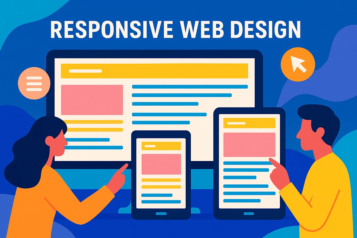
Responsive Web Design ensures your website delivers a consistent and user-friendly experience across all devices and screen sizes.
Responsive Web Design ensures your website delivers a consistent, high-quality experience across desktops, tablets, and smartphones. At Minnesota Design Studio, we create responsive websites that adapt seamlessly to every screen, keeping your brand polished and your content easy to use wherever your audience connects.
The Importance of Responsive Web Design
Responsive Web Design is no longer just a technical preference or a design trend. It is a core requirement for any modern website that wants to remain effective, competitive, and trustworthy. As mobile usage continues to rise year after year, businesses must ensure their websites work just as well on phones and tablets as they do on desktops and laptops. For many users, especially those without consistent access to home broadband, a mobile device is the primary and sometimes only way they access the internet.
Modern users expect websites to load quickly, display clearly, and function smoothly regardless of the device they are using. If a site feels cluttered, slow, or difficult to navigate on a smaller screen, users are unlikely to stay long. They may abandon the site entirely and move on to a competitor with a smoother experience. In this environment, poor responsiveness does not just create inconvenience. It directly impacts credibility, engagement, and potential revenue.
Responsive Web Design ensures that your website automatically adapts to the size, resolution, and capabilities of the device accessing it. Instead of forcing users into a one-size-fits-all layout, responsive websites shift intelligently based on screen size. Navigation adjusts to remain usable, images resize without distorting, and text stays readable without requiring zooming or horizontal scrolling. This creates a more natural and comfortable experience for users across all devices.
Beyond usability, responsive design supports consistency. Visitors should feel like they are interacting with the same brand and the same website whether they are browsing on a phone, tablet, or desktop. Responsive Web Design maintains that consistency by delivering a unified experience that feels intentional and polished at every screen size. This consistency builds trust with users and reinforces your brand identity, no matter how your audience chooses to connect.
Ultimately, responsive Web Design is about meeting users where they are. It removes barriers that prevent people from accessing your content and allows your website to perform as intended in real-world conditions. By prioritizing responsiveness, businesses create websites that are easier to use, easier to trust, and better equipped to support long-term digital success.
One Website, Every Screen
Responsive design adapts automatically to user devices.
A responsive website adjusts layout, images, and navigation in real time so users always receive a clean, usable experience on any screen.
What Makes a Website Responsive?
Responsive Web Design is built on flexible structures rather than fixed layouts. It uses adaptable grids, scalable images, and media queries that respond to screen size, orientation, and device capabilities. Instead of maintaining separate desktop and mobile versions, a responsive website relies on a single codebase that adjusts dynamically.
As screens get smaller or larger, page elements reflow naturally. Columns may stack vertically, navigation may shift into a mobile-friendly format, and text scales to remain readable. Interactive elements remain easy to tap and use across devices. When implemented correctly, responsive design feels natural and intentional rather than compressed or stripped down.
Why Responsive Design Replaces Mobile-Only Websites
In the past, many businesses created separate mobile versions of their websites. These mobile-only sites often offered reduced functionality, inconsistent branding, and limited content. They were also expensive to maintain, requiring duplicate updates and ongoing oversight.
Responsive Web Design eliminates these challenges by unifying the experience into a single website. Content updates only need to be made once, and branding remains consistent across all devices. This streamlined approach reduces complexity while delivering stronger usability and long-term flexibility as new devices and screen sizes emerge.
Google and Responsive Web Design
Search engines strongly favor responsive websites. Google has explicitly recommended Responsive Web Design as the preferred approach for handling multiple devices. Using a single URL structure and consistent HTML makes it easier for search engines to crawl, index, and rank your content.
Responsive design also improves engagement metrics such as time on site and bounce rate. When users can navigate easily and interact comfortably on any device, they are more likely to stay longer and explore more pages. These signals contribute positively to search visibility and overall SEO performance.
Built for SEO and Performance
Responsive websites support stronger search visibility.
Single URLs, consistent structure, and improved user engagement help search engines understand and rank your content more effectively.
User Experience and Conversion
User experience plays a direct role in whether visitors convert into customers. A responsive website ensures buttons are easy to tap, forms are simple to complete, and navigation behaves predictably on all screen sizes. When users feel comfortable and confident navigating your site, they are more likely to engage and take action.
Poor responsiveness creates friction that can quickly erode trust. Inconsistent layouts, broken menus, or difficult interactions can push users away before they reach your content. Responsive Web Design allows you to maintain control over how your site appears and functions in every context, supporting both usability and conversion goals.
Simplified Website Management
Managing multiple versions of a website increases complexity for businesses and marketing teams. Responsive Web Design simplifies management by consolidating everything into one site. Updates are faster, analytics are cleaner, and content stays consistent across all platforms.
This streamlined approach saves time and reduces the likelihood of errors or outdated content appearing on certain devices. It also creates a stronger, more cohesive brand presence by ensuring messaging and design remain aligned everywhere your audience interacts with you.
Future-Proofing Your Website
Responsive Web Design is inherently adaptable. Because it relies on fluid layouts rather than fixed dimensions, your website is prepared to handle new devices, screen sizes, and technologies as they emerge. This flexibility reduces the need for frequent redesigns and protects your investment over time.
Rather than reacting to new trends or device releases, a responsive website allows your business to stay ahead by design. Your site remains usable, modern, and effective regardless of how technology evolves.
Why Choose Minnesota Design Studio
At Minnesota Design Studio, we design and build responsive websites that prioritize performance, usability, and long-term success. Our process begins with understanding your business goals, audience behavior, and brand identity. From there, we craft custom layouts that adapt cleanly across all devices while maintaining visual consistency and clarity.
We focus on clean structure, intuitive navigation, and accessibility best practices. Every responsive site we build is optimized for speed, SEO, and ease of use. You are involved throughout the process, ensuring the final website reflects your vision and supports your objectives.
From Planning to Launch
Responsive Web Design is not just about layout. It is about strategy. We design websites that guide users toward meaningful actions based on your goals, whether that means generating leads, increasing inquiries, or driving sales.
If you are reworking an existing site, we can identify usability issues and performance gaps. If you are starting fresh, we guide you through every decision with clarity and transparency. The result is a responsive website that works everywhere and supports your business consistently.
Build a Website That Works Everywhere
A responsive website gives you an advantage across devices, platforms, and user behaviors. At Minnesota Design Studio, we build responsive websites that scale to every screen and support real business outcomes.
If your current site struggles on mobile, feels inconsistent across devices, or is difficult to manage, it may be time for an upgrade. Reach out today to learn how a responsive website can strengthen your digital presence and help your business grow.
SATISFACTION GUARANTEED
We stand behind our results 100% and are confident you will be satisfied with what we can create for you.